
This is the entire story of antisemitism and the Israel / Arab conflict delivered in two simple maps. One map is based on Jewish populations in the 1930s, the other Jewish populations today. The maps are not just of Europe or the Middle East, but the entire Europe, Middle East and North Africa region. People love to make everything seem complex. Sometimes the best thing to do is cut out the noise:
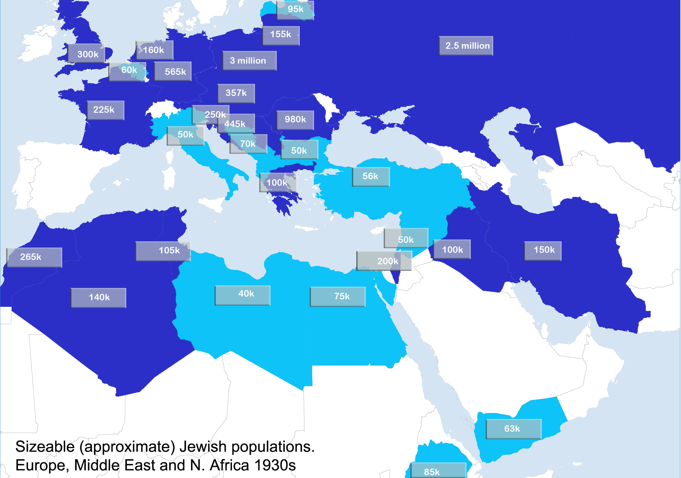
Map: Jewish populations Europe and MENA region 1930s
Map: Jewish populations Europe and MENA region 2010s
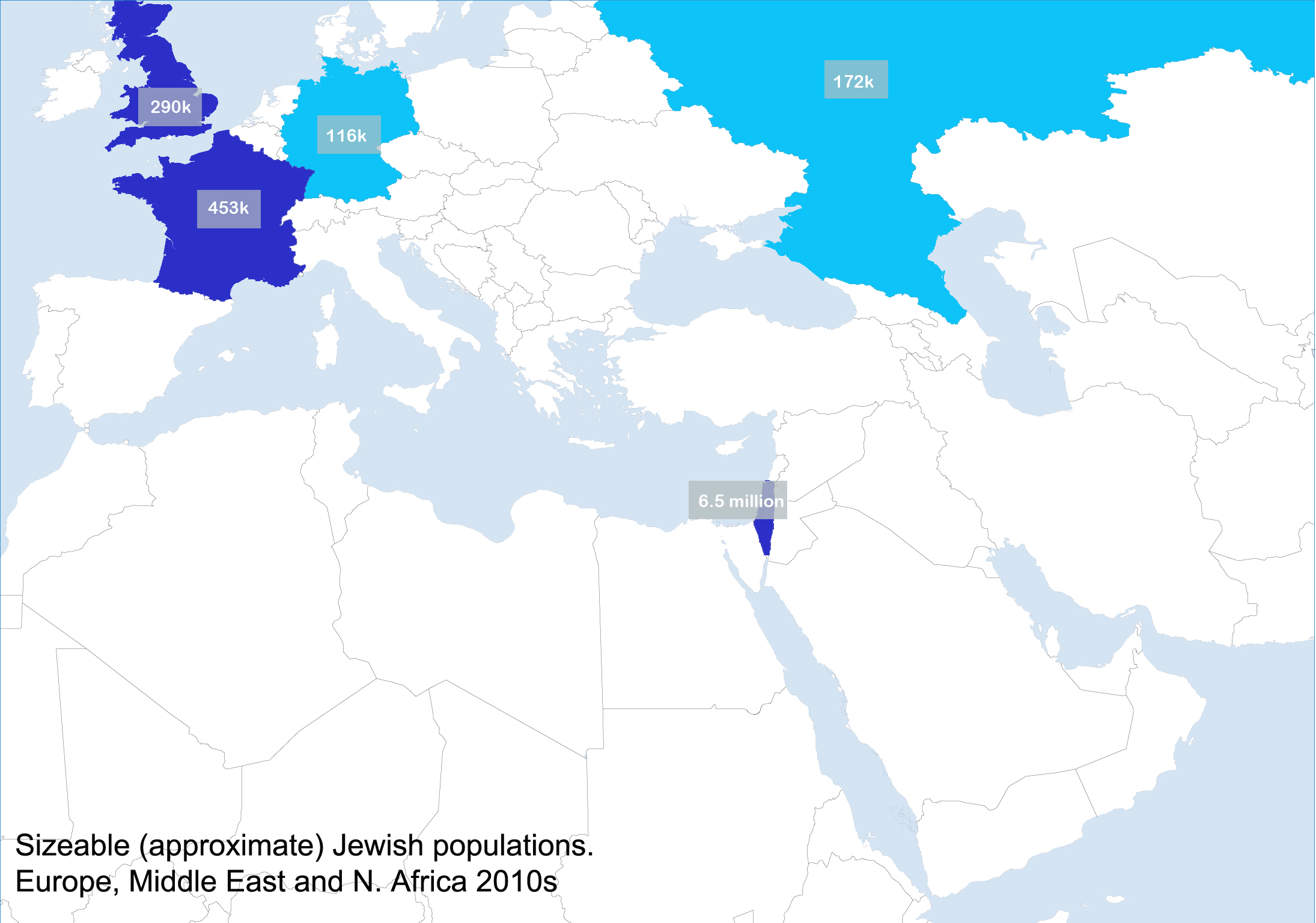
If anyone notices any important mistakes, let me know. The figures in the maps are a collation of official European pre-holocaust figures, scholarly estimates from the Arab ethnic cleansing of their Jewish populations and contemporary population figures. Only significant populations of 50k+ have been considered unless the population is smaller but still a sizeable % of the total population.
Put the two images side by side and everything suddenly becomes clear. The horrific scale of the destruction of Jewish communities. But also the antisemitic obsession with Israel. Some spend their time arguing that anti-Zionism isn’t antisemitism, but just look at the maps. Tell me that having hounded, persecuted, expelled and murdered their Jewish communities throughout the regions, that the current obsession with that one tiny concentration of Jews that is left – the Jews in Israel – isn’t driven by antisemitism.
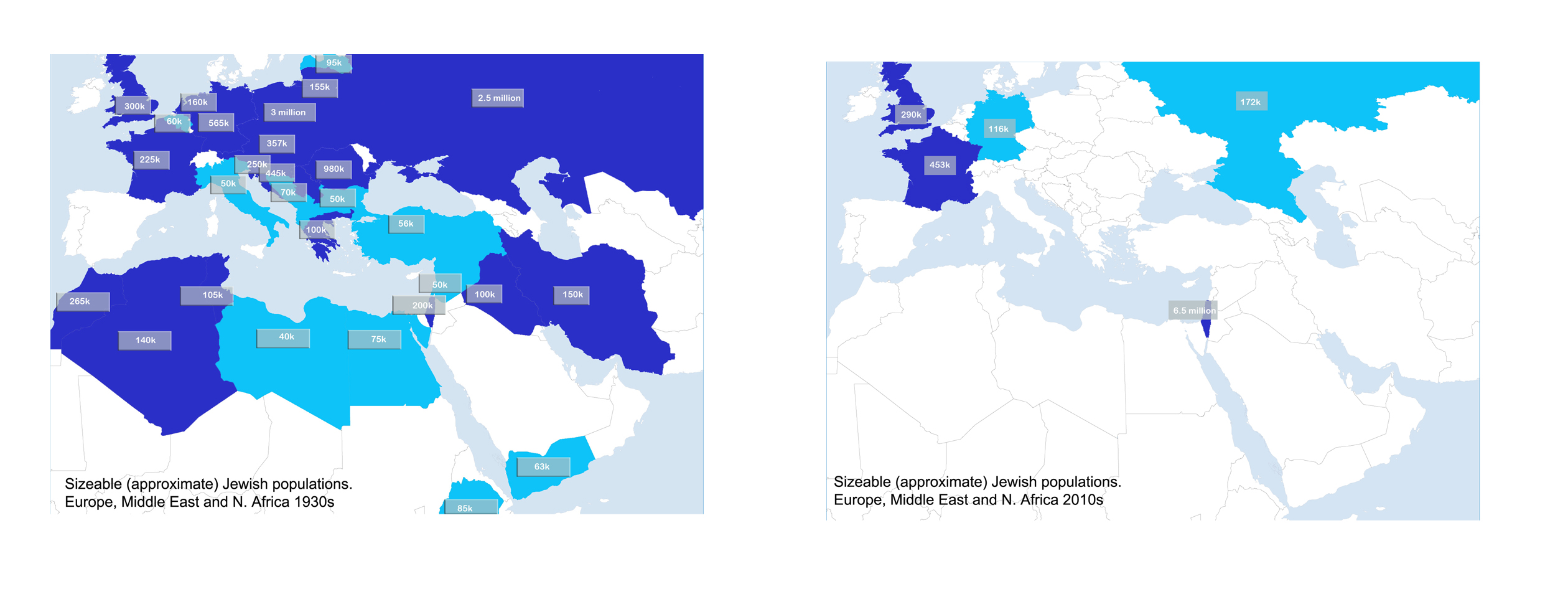
Much of it was far-right genocide. In other places Islamist ethnic cleansing or rising Arab nationalism. Elsewhere it was soviet / marxist persecution. Each of these antisemitic forces points the finger at the other – most in total denial about the antisemitism in their own camps. But look at the maps. It does not matter if the hate is coming from an Islamic flag, the Soviet flag or the Swastika. In the end they all got rid of their Jews. Now, chillingly, they all fixate on the oasis that the Jews ran to.
Sometimes you don’t need to argue. You just need to stop and to look.
——————————————————————————————————-
Please help to support this research
This blog is unique. I engage in deep research, much of it undercover, into anti-Jewish hatred, anti-Zionism and anti-western extremism. Your support really does make all this possible. Reports such as this can take months and consume considerable resources. By placing the evidence in such concrete form, they do change the narrative. My work is fully independent and I uncovered many stories on this site that created headlines across the globe. I was recently named as one of the J100 (‘top 100 people positively influencing Jewish life’) by The Algemeiner. If you can, please consider making a donation towards the research.
You can make PayPal donations using the donate button above. I also have a Patreon page that also facilitates small monthly donations.
Every contribution is truly appreciated.
![]()
![]()
![]()
![]()
![]()
![]()
![]()
The post Antisemitism and the conflict – explained in two simple maps appeared first on The David Collier blog.
Leave a Reply